PrescribeWell Mobile App
Medication Management
Project Overview
TIMELINE
5 Months
TOOLS
Sketch
Invision
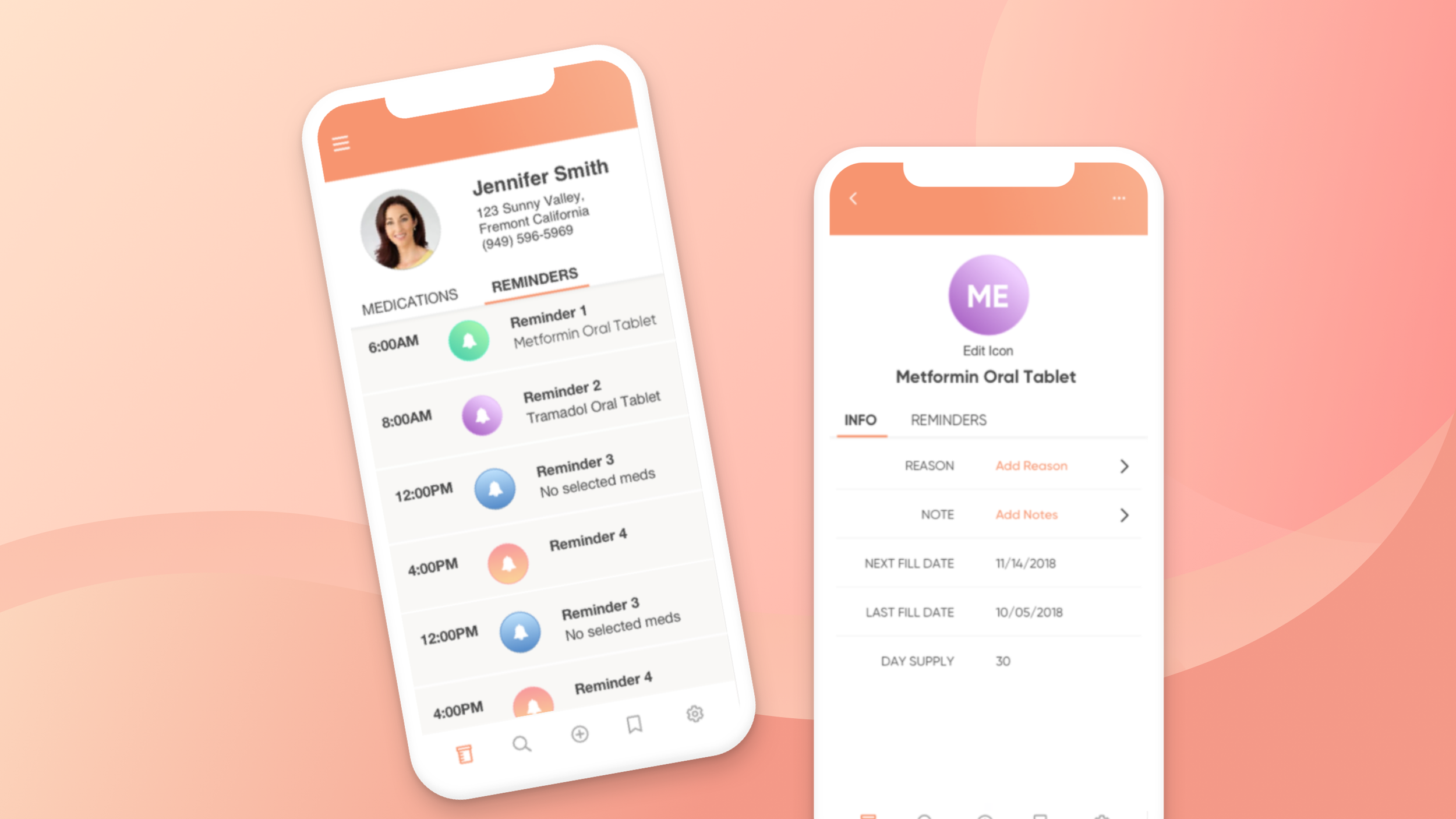
The PrescribeWellness consumer app allows patients and caretakers to access their entire medication list immediately out of their pocket. Additionally, they are able to set daily reminders on when to take their medications.
MY ROLE
UX Designer, UI Designer, Information Architect, QA
Problem Statement
Patients struggle taking all their medications accurately as prescribed because they have too many medications with different directions making it difficult for them to remember and manage.
Project Goals
Display a list of all prescribed medications that is easily readable
Show which medications have reminders
Ability to set reminders
Ability to change medication photos
Design a secure way for users to create an account


Research & Define
I spoke to the internal stakeholders and product managers of this mobile app to get a better understanding of the business needs and goals. I learned that the 2 main consumers using this app would be senior patients and caretakers of patients.
User Pain Points:
Medications have such long scientific names, I never know which one is which.
I can’t tell which medication does what.
All the medications I take each have so many different directions. If only they had the same set of directions.
We got a hold of a schedule a patient made to help them take all their medications. It is compilation of all their prescriptions, generic drug name, drug purpose, dosage directions, and the physician who prescribed it. This key information played a vital part in driving the design for the consumer app.

Comparing Initial Designs
I started off brainstorming different ways to display medications. After reviewing it with the product managers and stakeholders, we decided some additional requirements on the medication list include the dosage directions and ability to add notes for each medication. Taking these new requirements into consideration, we narrowed the profile down to 2 different versions.
Version A

Version B

Version B was selected because it offered more real estate to the app, allowing users to view a lot more medications at once. It also had more flexibility for users to read notes on the first-level view and resembled a similar look-n-feel to a medication list. Ultimately, users found it easier to read and scan through a lot of information quickly in a list view rather than the tile view in Version A.
User Flow
The main goal for the consumer app is for patients to easily access their list of medications, look at the medication details, and set reminders to take their medication.

UX Writing
Crafting the Language During Initial Account Set up
I was in charge of the language on the mobile app when consumers first create their accounts. The purpose was to help users set up their profile. Some tasks included:
Giving clear and concise directions.
Establishing the product’s tone: We wanted a positive and approachable voice to be used across the app.
Useful actions for the next steps.


Final Design
REFLECTIONS
We were able to meet our goals for releasing our MVP: allowing users to access their medication list, view its details, and set up reminders.
We went through multiple iterations, but are continuing to add new features for the next phase. After our release, we have already found some pain points in setting up reminders we hope to address in the new update.
PROJECT LIMITATIONS
Developer resources were limited
There was a hard deadline for the MVP release
Design was fixed to what was available in the developer’s code library