Zscaler
Design System
Our company’s single source of truth
Project Overview
Transformed the team’s design process and managed the company wide Design System initiative which resulted in saving the company at least 10,000 collective work hours due to the 90% reduction in redundant UI components and workflows.
TIMELINE
June 2021 - Present
TOOLS
Sketch
Figma
Asana
Invision
ZeroHeight
ZDS 2.0 is our company’s reinvented design system. It is intended to create accessible, reusable end-to-end components as well as a modernized consistent user experience across our suite of products.
As the project lead for ZDS 2.0, I’ve had the opportunity to collaborate with designers, engineers, and the marketing team to build a cohesive system with a long term ROI.
MY ROLE
I managed the design system initiative that’s currently being used by 10 product designers and more than 30 UI Engineers at Zscaler. Additionally, I streamlined our UX Design team’s design process as we were transitioning design tools from Sketch to Figma to increase work efficiency within the team.
Problem Statement
For users who own multiple Zscaler products, they want to find information quickly and easily across all modules. However, this is a challenge for them because each product looks and behaves differently.
Design System Goals:
Design exceptional, customer driven experiences
Create a clean and modern look with our new rebranded color palette
Build a consistent and reusable UI component library
Have a single source of truth that designers/developers can all align on
Ensure our components and patterns pass the WCAG 2.1 accessibility guidelines
The design system is a long term investment for the company. As Zscaler scales and grows our design team and portfolio of products, having consistency and alignment in all our designs has been critical. Therefore, the UX Team made a huge effort this year to prioritize ZDS 2.0

Research & Define
The UX Team used principles from Atomic Design to create our design system. This mental modal uses atoms, molecules, and organisms to help us define our components and how to organize our user interface. Below are examples of our system’s structure:
Atoms = color palettes, typography, icons, logos
Molecules = buttons, dropdowns, text inputs, toggles
Organisms = forms, wizards, dashboards, data log reports

Design System Process
Our process-oriented approach allowed us to keep track of all our designs at the component level and helped us streamline requests or updates for new UI components and patterns.

Competitor Analysis
The UX Team initially looked at other strong design systems to get an idea of how things were organized and which aspects were important and helpful. We compared them to each other and put our findings below. After this, I started the initial steps to transform our design system.

Initial Steps
1) Compiled all components in our current products & identified different variations
2) Assigned components to a specific designer to update and define rules
3) Tracked component updates in Asana
4) Set up weekly design system meetings to review components and patterns
5) Facilitated routine discussions with product managers and UI engineers to gain approval and alignment

Design System Inconsistencies
I organized a brainstorming session where the UX Team compiled all components that currently exist in our products. We started looking into our dropdown components, one of the most used patterns in our products. After grabbing screenshots, we found at least 10 different variations throughout our product suite. This confuses users because our patterns are not consistent or behave the same. This was an issue we received a lot of negative feedback on so our priority was to make our user interface consistent throughout all Zscaler products. One of our first steps to mitigate this was adding all the variations into one file and narrowing down the component options based on the specific use cases for our users.

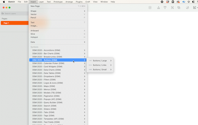
Design Tool Transition
While we were creating our Design System components, our UX Team was also transitioning design tools from Sketch to Figma. This period came with a lot of challenges as designers, product managers, and developers had to work simultaneously between two different types of design tools to build a modular component library while ensuring features to customers were still shipped in time.
Team Pain Points:
Where can you find the most up-to-date design system components?
How can you look at designs/components in progress vs. components that have been locked?
Is there a centralized place to access all designs?
After listening to all these pain points from the cross functional teams we collaborated with, I initiated a brainstorming session with the UX Team to discuss ways we can reorganize our design files in Figma so that there was a standardized system in how designers collaborate so that new designers and developers could find and access design files quickly. This started with doing research on how other design teams organized their files.

Design File Structure
During our brainstorming session, I narrowed down 3 file structure suggestions to the UX Team and we all discussed the advantages/disadvantages of each structure. We also included engineers and product managers into our discussion to understand to get their feedback and ensure it worked for all teams. In order for our file structure and process to be successful, it’s important for all teams to be aligned with the design process.
Option A
Teams = Product Name, Project Space = Module Name, File = Release Names

Option A was not as scalable because there could be a lot of module names in the left menu and the right side would not consist of many release files so it did not optimize the real estate space. Additionally, there is no holistic view of all the modules in 1 space. The modules can also get really big, so it might need to be split into smaller submodule files.
Option B
Teams = Product Name, Project Space = Release Names, File = Module Names

Option B was favored most by the team because it had less projects to manage from the left menu, there was a holistic file view, and we could use the workspace feature to control access to specific people to avoid confusion. The team also liked how the pages within each file were organized.
Option C
Teams = Product Name, Project Space = Role Names, File = Module Names

Option C was the least favored because it provided no clarity on release version and was difficult to manage because there would need to be duplicate files for different project spaces. In the long term, it could potentially cause more confusion.
Designing for Accessibility
Another key aspect in the design system was ensuring our designs are inclusive to all users. The UX Team wanted our products to be usable and accessible for everyone, including those with disabilities. To adopt this design model, there were a few things we tried to keep in mind:
Gain a basic understanding of main disability categories which include: vision disabilities, hearing disabilities, motor problems, etc.
Design for progressive enhancements where Zscaler products can help users who are using the most basic technology.
Ensuring we have a diverse group of participants while conducting user research that come from different backgrounds, circumstances, and abilities.
WCAG Compliance
The UX Team used the most up-to-date Web Content Accessibility Guidelines (WCAG 2.1) to ensure our design system components passed all the requirements and criteria. Some of the tools we used was the Color Contract checker plugin on Figma to test all our design components. Additionally, we worked with the development team to ensure the implementation was high quality by using the open-source Lighthouse plugin. Ensuring our design system is compliant is something we are striving to improve and still currently working on today as we audit our entire product’s user interface.

Design System Foundations
The UX Team centered our Design System off of some basic foundations. This included identifying the basic building blocks for our design system, how to name our design components, and organizing our design files into manageable categories.

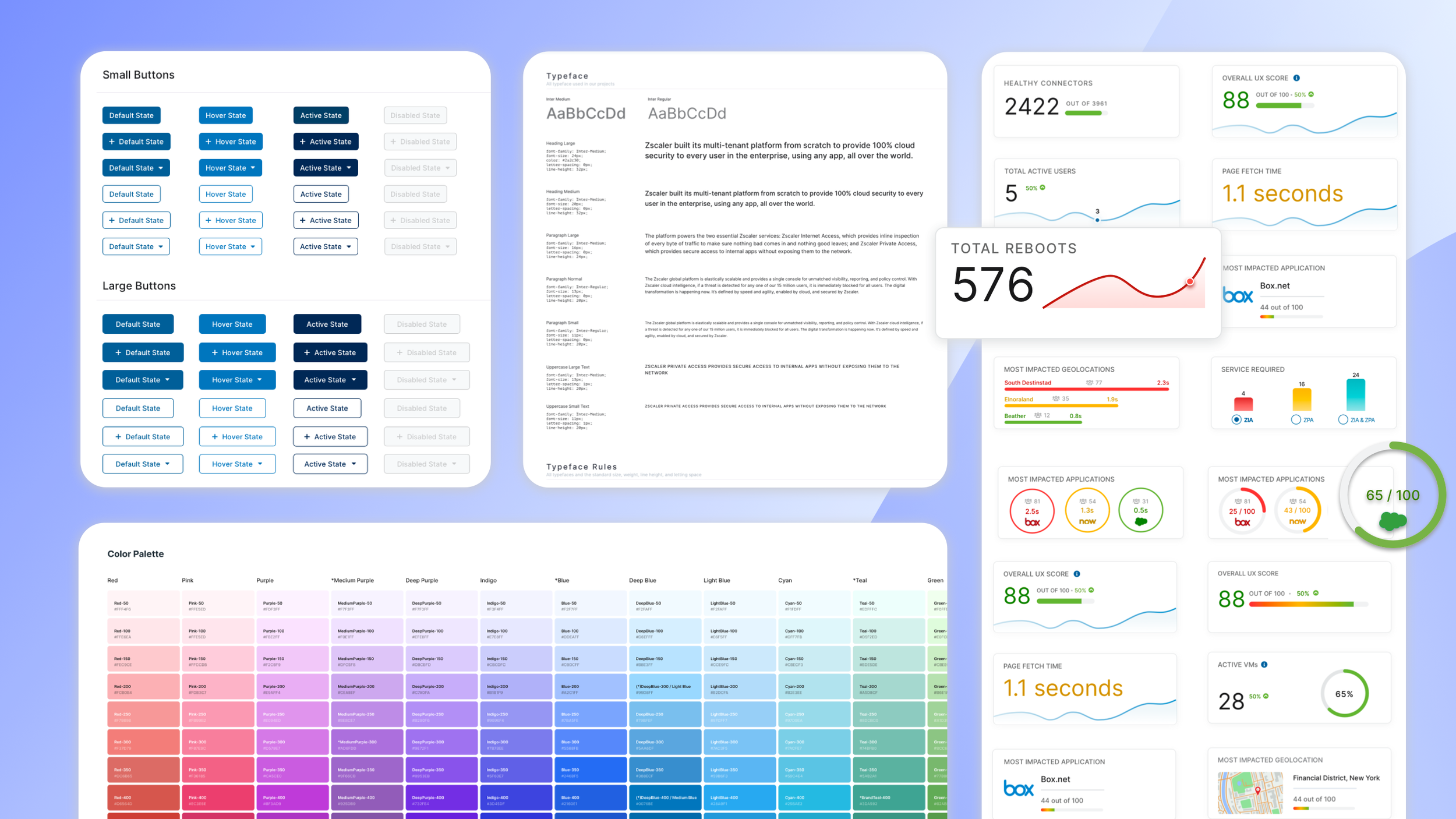
Color Palette
We started off with our primary colors for our color system. From there, we identified other areas where colors were widely used such as backgrounds, borders, surfaces, charts, etc.
Our color palette expanded our library’s color shades to allow for more design flexibility
We also verified accessibility by checking the contrast ratios with standard web accessibility guidelines
Specifications
We documented rules and specifications in detail at each component level
We established specs for minimum and maximum widths/heights to incorporate responsive layouts
We used a 4-pixel spacing system to easily scale our products across different device sizes

Naming Convention
We used a nested naming structure to make our components easy to find
Recognizable and universal terms were used that our team was familiar with
Naming rules: began with the most stable variable first followed by its properties: Component Name > Size > Style > State
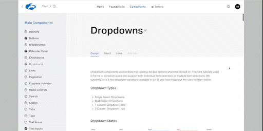
Documentation
A crucial part of a design system is ensuring there is detailed documentation put into place. This is critical to maintain because having well-kept rules ensures alignment and consistency across all products and teams. When starting on new projects, this is referred to frequently as the single source of truth. We hosted our design system on Invision and sent out Release Notes regularly to summarize any component changes.
Key Findings
CHALLENGES
A lot of changes occurred while the UX Team was trying to implement our design system, making it difficult to standardize things. This included:
transitioning to a new design tool: Sketch —> Figma
adopting a temporary DSM platform that hosts source files from both Sketch and Figma tools
integrating our Zscaler’s new rebrand efforts to our color palette
onboarding new hires who wanted to review our current designs
NEXT STEPS
Set up regular meetings with engineering to transition our current color system to the new color palette. Design tokens can be beneficial for this effort
Maintain design system documentation and updates
Establish a strategy to incorporate new design explorations/ideations with our existing design system
Transition and implement our UI library to the new Figma design tool
Implement additional color themes: light mode and dark mode
Continue to audit the Design System and ensure all components have passed the latest WCAG 2.1 guidelines